The Cost of Living in Brazil
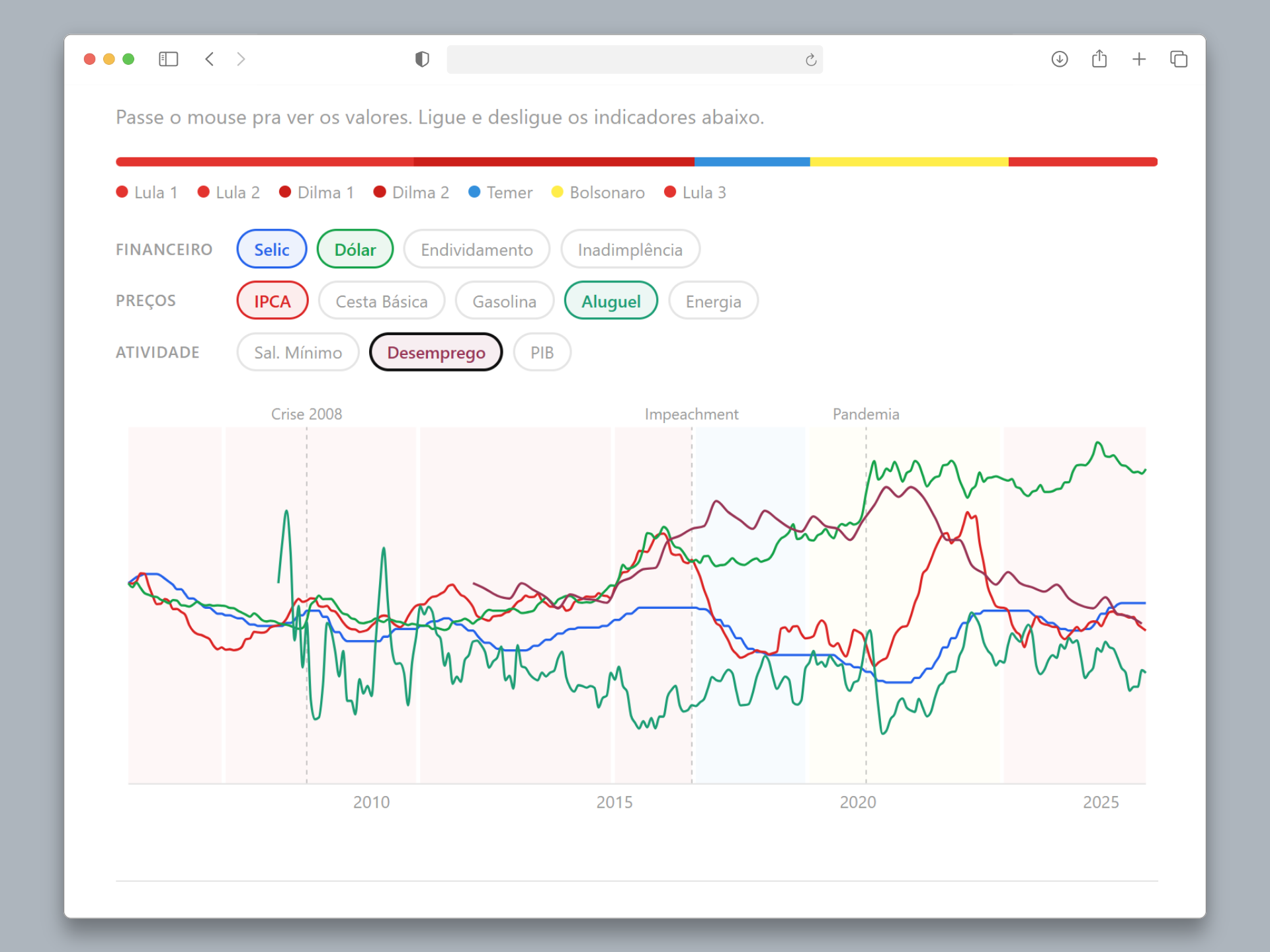
Interactive dashboard visualizing 8 Brazilian economic indicators over 20 years, using public data from the Central Bank, DIEESE, and ANP.
- Python
- Next.js 14
- Recharts
- GitHub Actions
- Cloudflare Pages
Context
Brazilian economic data is public, but scattered across dozens of government websites, each with its own format and quirks. For an ordinary citizen — or even an analyst — understanding how the cost of living has evolved over the past 20 years requires hours of manual collection and spreadsheet cross-referencing.
The Problem
How to transform scattered, hard-to-access public data into a visual narrative that anyone can understand?
Technical Decisions
I chose a static site architecture with an automated data pipeline:
- Python for ETL — custom extractors for each source (BCB SGS API, DIEESE via web scraping, ANP via CSV)
- Next.js 14 with static export for the frontend — maximum performance, zero server
- Recharts for visualizations — chosen over D3.js for productivity and React integration
- GitHub Actions for weekly automatic data updates
- Cloudflare Pages for deployment — global CDN, free
A key decision was using base-100 normalization to display indicators of different scales (IPCA, minimum wage, gas prices) on the same chart in a comparable way.
The Process
Brazilian public APIs have their pitfalls. The BCB returned 406 errors without the Accept: application/json header. DIEESE renders tables via JavaScript, requiring a different scraping approach. ANP changes its CSV URL patterns periodically.
Each problem required a defensive extraction strategy — retries, fallbacks, and data validation before processing.
The editorial design was inspired by Our World in Data and Nexo Jornal: no gradients, no shadows, serif typography for narrative text, chapter-based structure with hardcoded text and dynamically calculated data values.
The Result
A functional dashboard with 8 economic indicators, automatically updated every week, accessible on any device. A 100% automated data pipeline that has been running without intervention since launch.
Lessons Learned
- Brazilian public APIs require defensive extraction strategies — not everything documented works as expected
- Base-100 is the right approach for displaying time series of different scales on the same chart
- Editorial design (narrative + data) produces more impactful results than pure visualization